Project
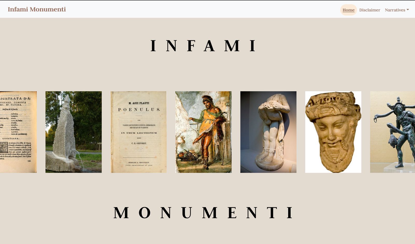
Our project is a web application called Infami Monumenti, designed to offer users the chance to discover and explore the history of phallic culture. We chose the name Infami Monumenti because topics like this are often seen as taboo and they are frequently avoided in public discourse, despite the lack of awareness or understanding of their historical significance. With this project, we aim to break down those preconceived notions and show that phallic culture is not merely about crude imagery or vulgar associations. Instead, our goal is to shed light on its historical and cultural value. In the past, the phallus was regarded as a powerful symbol, rich in meaning and significance, often represented through various forms of artistic expression, such as sculptures, paintings, literary works, and more.
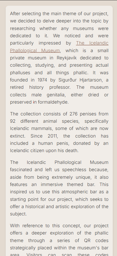
In the process of defining the theme for our project, we discovered the Icelandic Phallological Museum, a small private museum in Reykjavik dedicated to collecting, studying and displaying mostly whale phalluses. The museum - founded in 1974 by Sigurdur Hjartarson, a retired history professor - collects 276 penises from 92 different animal species, specifically icelandic mammals, some of which are now extinct, either dried or preserved in formaldehyde. Since 2011, the collection has included a human penis, donated by an Icelandic citizen upon his death.
This peculiar museum, which also features a themed bar, made us think about the long lasting fascination exerted by phallic symbols worldwide, and gave us the inspiration for our web application, which we conceived as a complementary virtual exhibition that takes place in the space of the bar. We imagined an Exhibition Space within the bar area, where visitors are able to scan strategically placed QR codes and discover an heterogeneous set of artifacts somehow associated to the phallus as a symbol of life and power, choosing between alternative narratives.
Layout
Graphically representing a story of Phallic Culture involved thinking about what the metaphors of this culture are. The verticality of objects that mimic the phallus in different cultures was the first starting point. It also represents, in some of the societies presented here, the notion of fertility, in a clear allusion to the growth of plants, animals and fortunes. To achieve this, the use of sidebars to guarantee access to content was prioritized. Another functionality explored was content scrolling. This required the use of wide margins for large screens, and dynamic layout programming that prevents text from being squeezed onto smaller screens.
Colors
As Priapus is the most recurrent Western representation over time of the concept of the phallus as a symbol of power, we chose the most famous image of this deity, the fresco from the Casa dei Vettii in Pompeii as the starting point for the overall color palette of this project. The colors were extracted using palette identification tools through images such as those offered by Canva and Adobe Color. Thinking of the website as a virtual museum, neutral and soft colors were designed for the background. In contrast, the body texts were given bold colors.
General Color Palette
Typography
As the items collected in our exhibition portray different contexts and cultures, we selected a neutral font for the body text. Our choice fell on Inter, a highly readable font that was specifically designed for computer screens, and - more precisely - on the style Light 300, which provides a clean and yet easy-to-read look. In order to add depth and hierarchy to the text, we then paired Inter with a serif font, namely Judson, which was used for the title of our project as well as for headings.
Museum
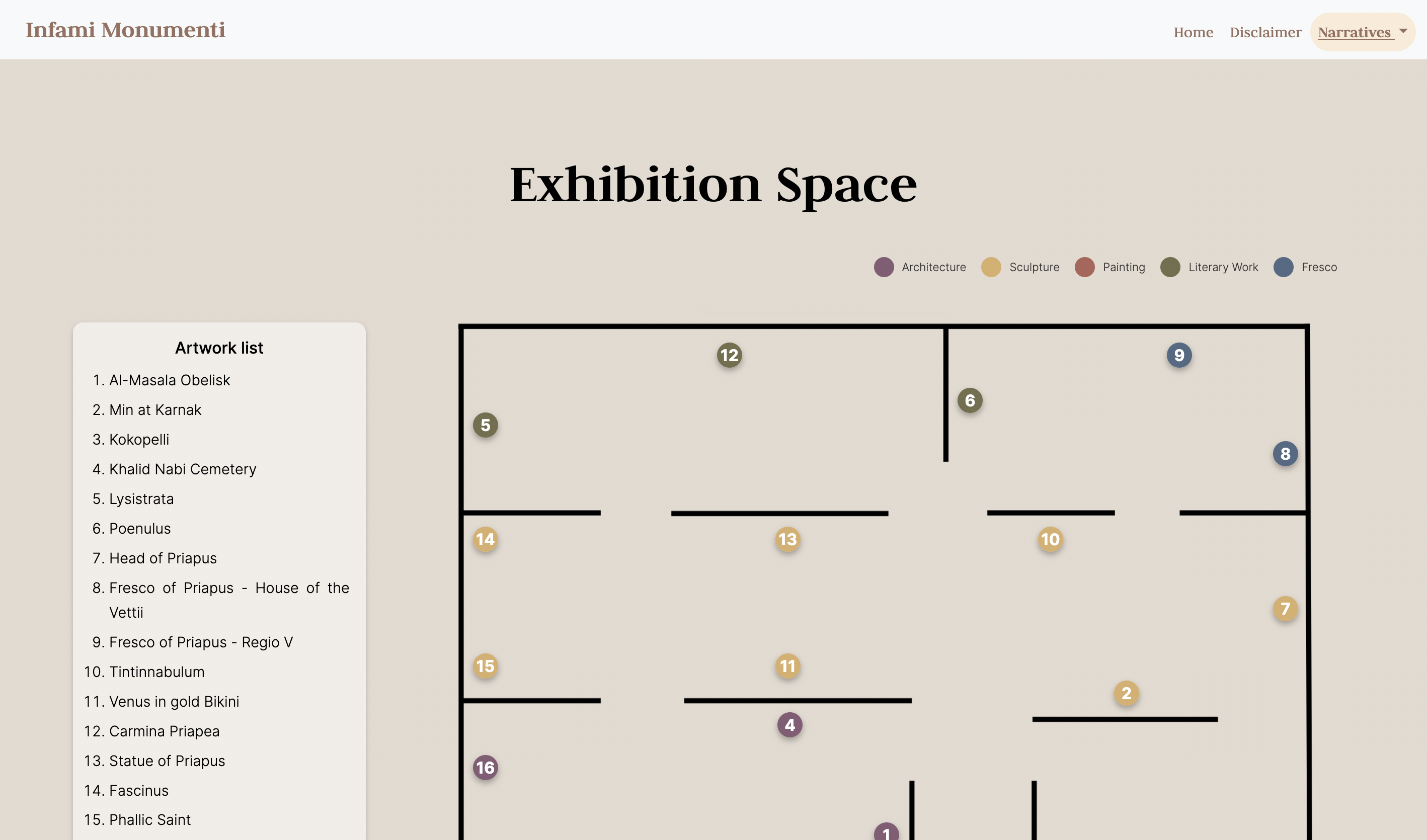
The organization of items to tell the History of Phallic Culture was thought of as a museum exhibition, placed in the themed cafè of The Icelandic Phallological Museum.
Layout
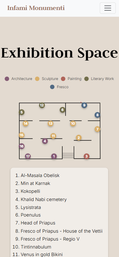
Trying to reproduce the feeling of starting a visit to a museum, we sought a different layout on this page. This page mimetizes a map of the space of the exhibition, and at the same time provide a little program, explaning the context of the space in the text under the map. The numbers inside every point in the Exhibition Space provide a suggestion of a chronological view of the objects and the colors provide a division by artistic category, as well the organization by setting in different rooms.
Colors
To indicate the categories of the objects, we chose to use different colors on the points that identify them. For this purpose, we chose a palette that is present in the excavations of Pompeii and found in different studies on color in statues of the period.
Museum Color Palette
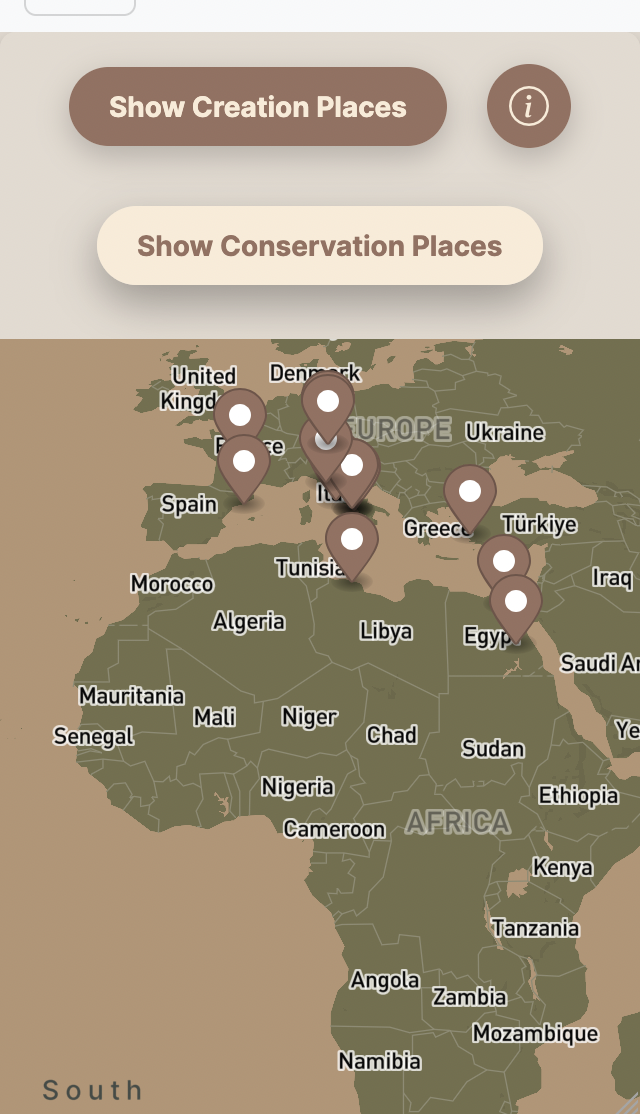
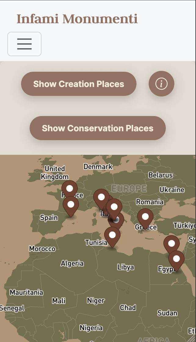
StoryMap
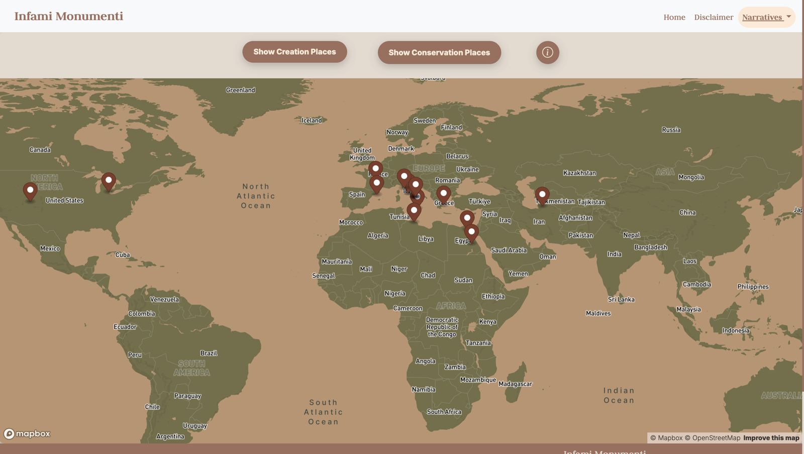
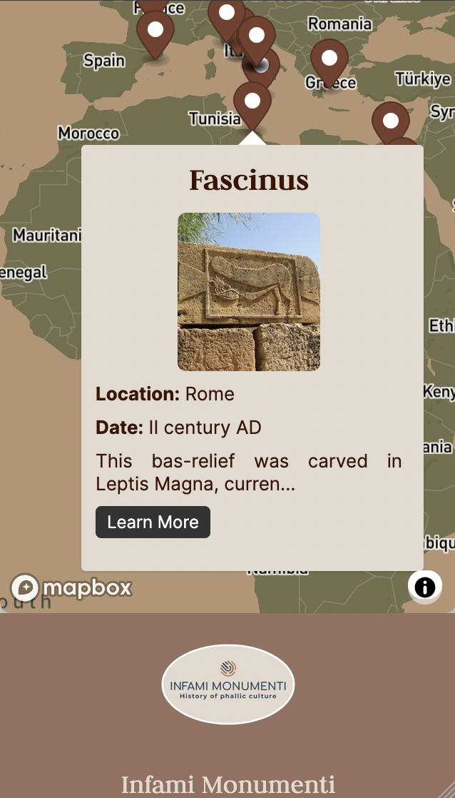
This interactive map traces the evolution of phallic culture through geography. Each pin in the map provide the location of one object selected for this project. Clicking on the pin, the map is centralized in that location and opens a pop-up box with information of every object. The button "Learn More" offers the possibility to go to the object page. The pop-up boxes, generate with a javascript (as the pins and their locations) that push the data from a JSON file, contain name, date, the beginning of the first text, and a bottom "Learn More" that allows the user to go the page of the object.
Layout
The map is in a responsive container box. The functionality of navigating the map in all directions simply by dragging it, and the reproduction of the map from east to west, allows users to have the experience of “traveling” around the world, even in the flat format of screens and the map provided. At the same time, the choice to center the map when an object is selected attempts to focus the user’s attention on the connections from the chosen point, also trying to provide the sensation that there is no central culture, emphasizing an equivalence of objects.
Colors
For the map styling we used Mapbox, a powerful mapping platform that enables developers to build and integrate custom maps and location-based services into applications. Offering robust APIs and SDKs, Mapbox provides detailed, interactive maps with customizable styles. Using the tool, we chose earthy tones from the tones already used on the other pages. This choice is related to the ancient belief that the phallus would be a symbol of fertility, including in agriculture, leading to the use of tones belonging to this universe.
Map Color Palette
Timeline
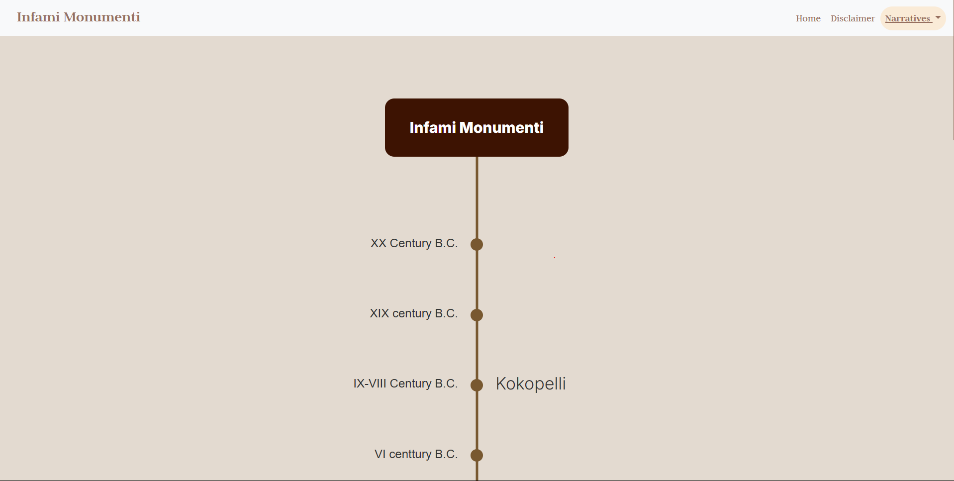
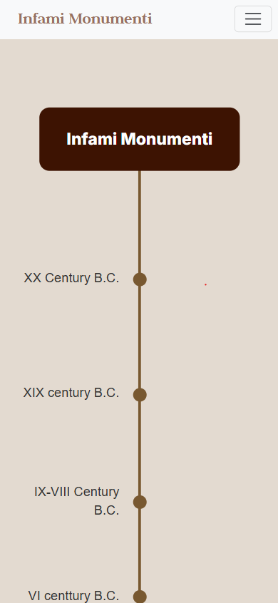
The Infami Monumenti Timeline presents a chronological journey through phallic culture, highlighting key artifacts spanning from the Ancient times to the 21st century. Each entry corresponds to an object featured in the project, allowing users to explore its historical significance in an interactive and visually engaging way.
The timeline was designed to reflect the organic evolution of phallic symbolism across different periods. By combining structured historical data with a dynamic interface, this feature enhances the user experience while maintaining historical accuracy.
Layout
The design of the timeline is inspired by metaphors of fertility associated with phallic culture. The visual representation resembles an intertwined branch that extends across the page, symbolizing growth and continuity.
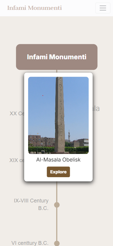
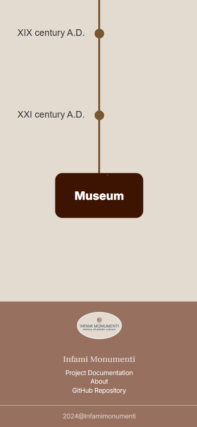
A central vertical line acts as the backbone, connecting different historical periods. Each event is represented by a circular node, which reacts to user interaction by expanding and displaying the title. Clicking an event opens a modal window with a preview image and additional details, along with a direct link to the object’s page. A “Museum” button at the end of the timeline invites users to further explore the collection.
Narratives
In order to represent the variety of objects associated to the theme of the exhibition, items were organized according to three main narratives: chronologically, spatially and by genre.
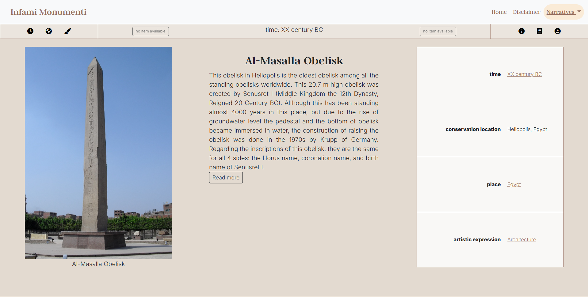
- Time: the narrative groups the objects according to the period they describe - which can be different from the date of creation of the items, revealing the persistency of symbolic representations associated to fertility and virility throught time.
- Place: the narrative organizes items according to the its original place of creation and its current conservation location (the place where e the object is exposed now a days). This is yet another way to observe the widespread cult of the phallus and the meanings associated to it worldwide.
- Artistic expression: the narrative presents items according to their genre, from visual artifacts - like paintings, frescos and sculptures - to literary works, to more recent experiments in architecture.
Features
Along with the option to switch narratives from the fields in the table, we decided to reintroduce the categories in which the items are organized in an offcanvas element, both to provide the user with an overview of the available options and to make navigation more immediate. The offcanvas can be toggled from a secondary navbar, that also includes a link to a modal window with some information on how to use the app.
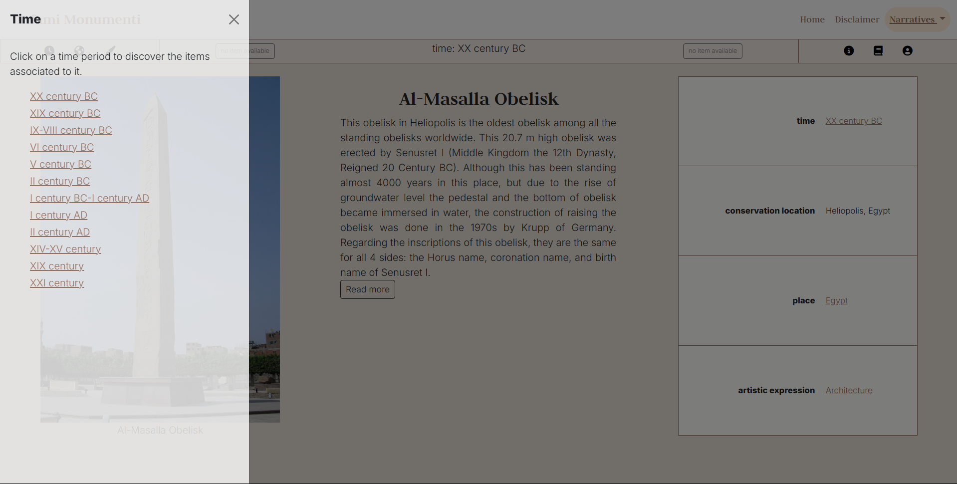
For each item in our exhibition, variables in the table were mapped to properties from Schema vocabulary. Schema properties — which may be of interest only to a specialized audience — can be activated when needed by clicking on the headers of the table, thus ensuring the ability to view the mapped property directly from the application. With the premise that the number of properties varies depending on the item (for example, not all objects have an author), the selected properties are listed below, along with a brief description of their meaning and usage.
| Feature | Property | Description |
|---|---|---|
| Time | temporal | The temporal property refers to the era of the origin of the work. |
| Date of production | dateCreated | The property is used in order to express the date of creation of a creative work. |
| Conservation location | spatial | This is a general property to be used when more specific ones, like contentLocation or locationCreated, are not appropriate. In this case, we chose the spatial property to indicate the place where the item is located and preserved |
| Author | creator | The property is used to indicate the creator of a creative work |
| Place | locationCreated | The property indicates the place where the creative work was created |
| Artistic expression | genre | This property specifies the genre of a creative work |
Layout
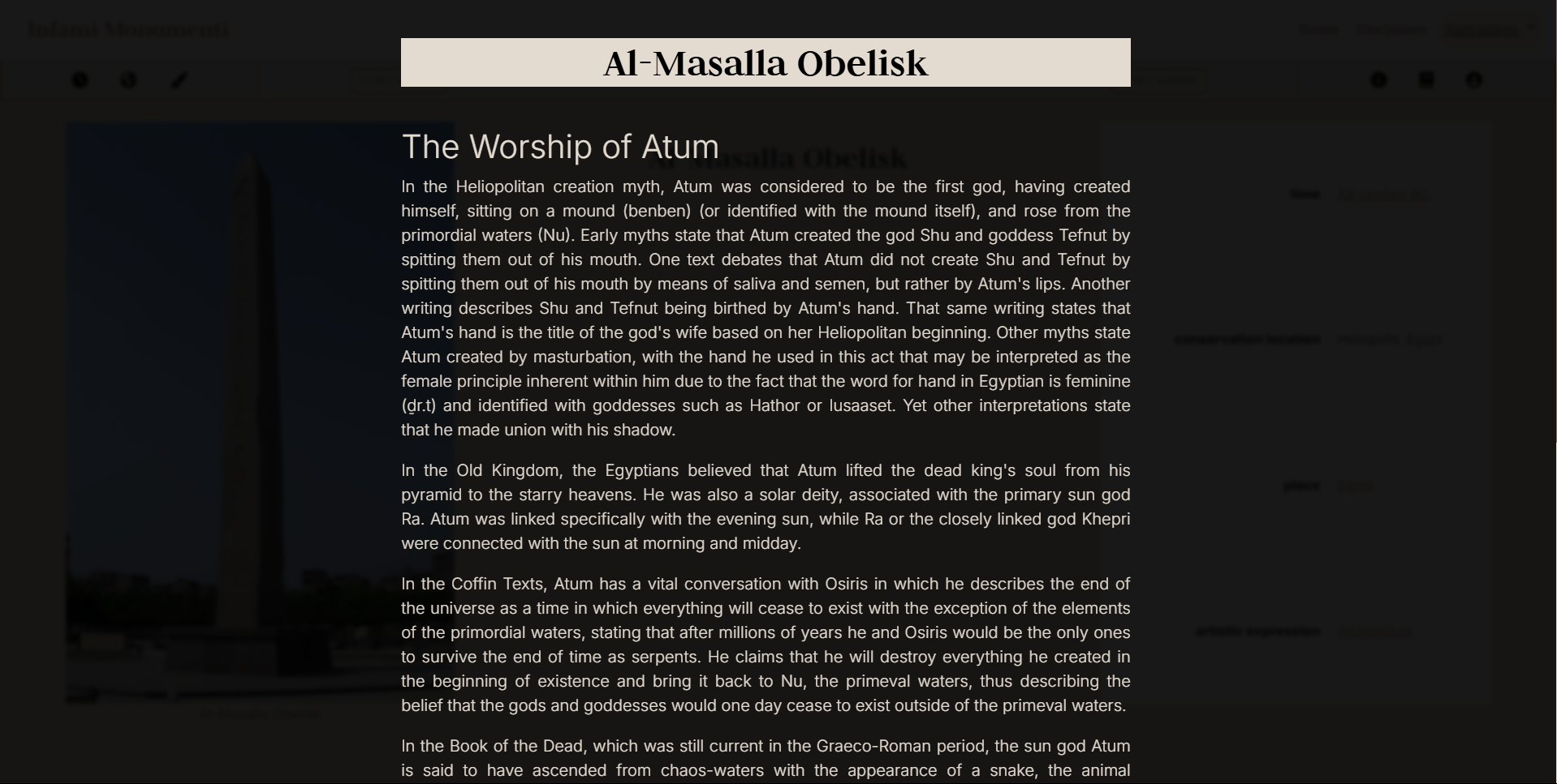
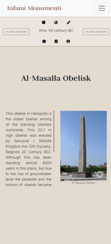
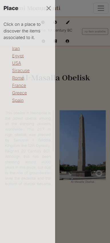
Starting from the article which inspired the title of the project, we tried to use strategies that could convey a sense of monumentality. Specifically, we organized the exhibition page in well defined horizontal and vertical areas, by meshing up Bootstrap components - such as the main navbar, the modal and the offcanvas elements - and CSS grid. The resulting layout is composed of three columns, one for each content available for the item: an image, some textual content and a table that gathers the main information about the object.
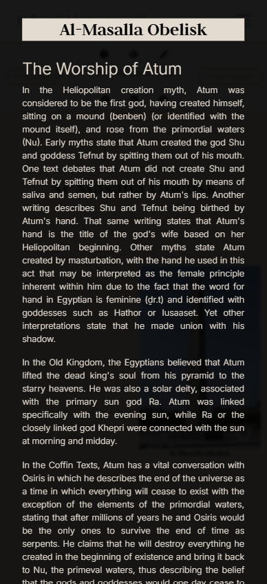
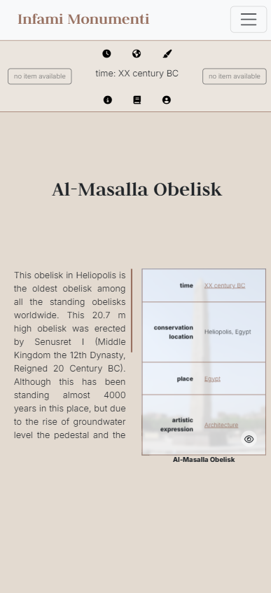
To avoid overcrowding the page and, at the same time, maintain the same design principle, for smaller screens we adopted a two-column layout, where the columns are preceded by the name of the item to which the contents refer. Textual content and image are displayed by default, while the table can be toggled by the user. Concurrently, the width of the offcanvas which controls the narratives selection was adjusted to convey a stronger sense of verticality by splitting the screen in half.
Finally, for both laptop screen sizes and and smaller screen sizes, we decided to reverse background color and font color when the full information about an item is loaded, in order to provide a better readability for a text which will require a longer reading time.